Top Navigation Redesign
Enhance Grand & Toy's top navigation by adopting minimalistic styling so that it better aligns with Grand & Toy's brand vision.
Scroll
The Process
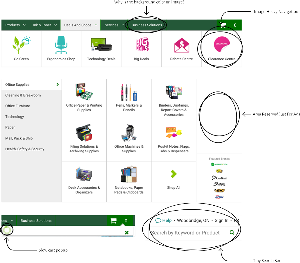
Interface Breakdown
- Image heavy navigation increases the load time.
- The mobile navigation hide some content available on desktop.
- Interacting with the navigation felt clunky due to lack of interaction design.
- Customers can only access top-level categories from the navigation and will need to go to a landing page to get more specific categories.
Design Opportunities
- The main focal point is on Navigation bar instead of the most used feature in eCommerce sites which is the search bar.
- The navigation bar cannot accommodate e-merchandizers ad campaigns.

Scroll
New Top Navigation
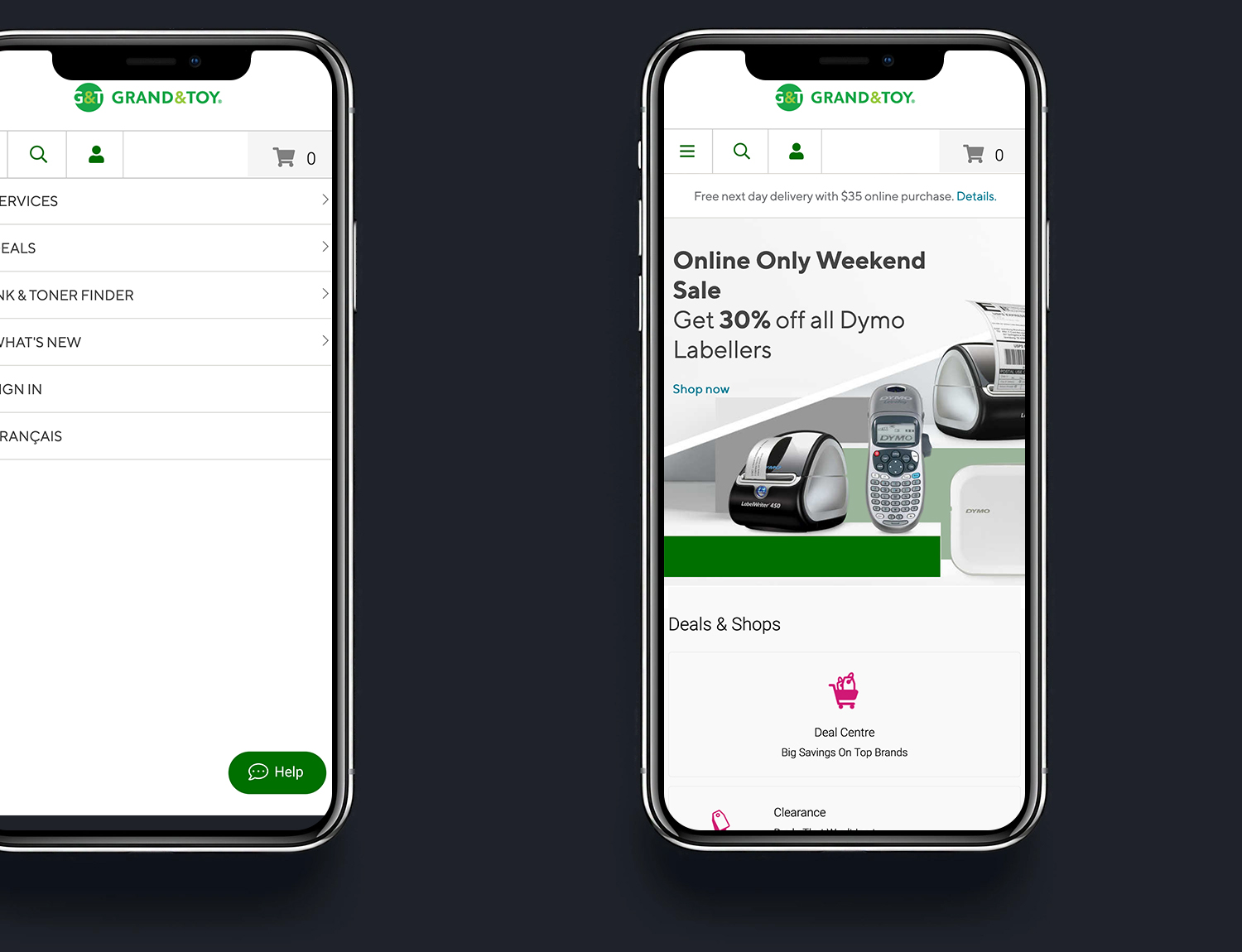
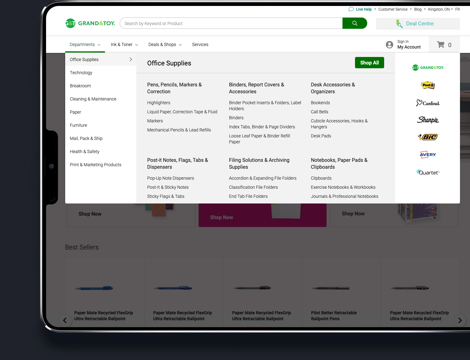
Enhanced Navigation
Company
Grand & Toy ( www.grandandtoy.com )
Highlights
- Minimalistic styling allows for dynamic focal points.
- The first focal point has become the search bar, which is the most used feature in any e-commerce site.
- The minimalistic design also shifts the focus to the full-width hero banner.
- The new top navigation reduces clicks by including third-level categories right in the navigation bar.
- Personalization is built-in with features such as showing relevant tools dependent on the account type.
- Strong emphasis on interaction design to guide the users' eyes.
- Enhanced performance due to removing all the product images contained within the top navigation.
- E-Merchandising now has a dedicated spot to advertise promotions such as deal center, or flash sale.
Technology
ASP.NET, Endeca, C#, HTML, CSS, CSS Transitions & Animations, JavaScript
My Role
Lead Front End UI Developer